Do you ever curse Facebook when you receive crappy leads from Facebook ads? You tried Google ads, content marketing, SEO, and LinkedIn and got poor quality leads or no leads at all, and it cost you a lot of money. I’ve been there, so many of you might have been there as well.
- Why is lead generation so hard to crack?
- Why is it tough to get quality leads?
- Why is it so challenging even after having such an easy 12-step formula?
We are all human, and it is natural to make mistakes. Lead generation involves a lot of moving parts. It’s almost like building a car or some other complicated machine. Even if you miss a single screw, the machine will fall apart. You won’t get the desired results.
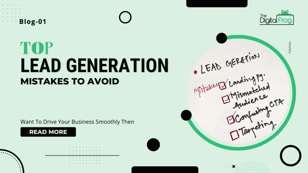
Avoiding mistakes is as important as following the right approach. let us discuss the top mistakes people make in lead generation. If you avoid these mistakes, you’ll get the quality leads you want to grow your business and career.
Mistake #1: Not having a landing page
The first mistake is an obvious one – people don’t use a landing page. Of course, you can use the built-in lead capture mechanism of ad platforms like Facebook ads. You will get more leads, but you will also get poor-quality leads. See, the job of an ad is to capture your audience’s attention, get them to notice your offer, and send them to your landing page.
When you use it to generate leads, the quality might suffer because you are packing too much in the ad. With a dedicated landing page, you can focus on explaining the bribe or the lead magnet the benefits of joining your email list, etc. to your visitors.
Remember, your audience doesn’t care about becoming your lead or what you offer. They are worried about sharing their details and getting spam messages. They don’t want to sign up at all. You need a landing page to alleviate their concerns, break their resistance, and convince them to trust you with their details.
Mistake #2: Having a “me too” landing page
Some marketers realize landing pages are essential, and they create a “me too” landing page following their competitors or some templates. Or they set up a basic landing page with a headline, a text block, and a lead form with a CTA button. A landing page is not something you set up in such a manner.
Your audience and your offer are different from your competitors or other templates out there. If you are offering the same thing everyone is offering, then your audience doesn’t have a reason to choose you and become your lead. Your landing page targets a specific set of your audience, offering a specific offer to solve a specific problem. It is almost unique for your campaign.
You need to communicate why they should become your lead, why they should care about whatever you are offering in exchange for their details, and how it can solve their problem or help them become better.
Mistake #3: Ad/landing page message mismatch
You’ve done a great job with the ad. You promised them a kickass solution in the ad. Your audiences are excited. They want it. They clicked and landed on your landing page. But they don’t see it on the landing page. They don’t see anything you mentioned in the ad.
The landing page doesn’t match the ad at all. Your audience is disappointed and leaves. You didn’t get the lead and wasted a click. Your ad and landing page should be on the same page, communicating the same message. Your landing should give a slight push to an already interested audience and convince them to sign up.
Mistake #4: Not having a CTA or having a poor CTA
This is the next classic mistake I see people make out there. Some people don’t even have a CTA on their landing page or think using a button with “submit” as the CTA is enough. Unfortunately, it isn’t. Your job is to motivate your audience to overcome the resistance to sharing their details.
Each phrase or word you use on the landing page should help him do so—every word matters, including what you use in the CTA button. Using “submit” as your CTA isn’t harmful or wrong. However, using a relevant CTA can improve performance and get you more leads.
Mistake #5: Poor Design
People create landing pages that look as if done by an amateur. Your landing page is your salesperson talking to your audience. Imagine if someone dressed in rags is trying to sell you something or asking for your details in exchange for something, how will you react to it?
You’ll not pay attention and try to move away as soon as possible, won’t you? That’s the impression people will get from a poorly designed landing page. The landing page tools and add-ons available can help you design a decent landing page without a designer.
Mistake #6: Not optimized for mobile.
I know it is impossible to accept and believe this. People are no longer desktop/laptop first when it comes to accessing the content. They use multiple devices, especially mobiles a lot to interact with your campaigns. If your landing page is not optimized for mobile, then your campaign is set to fail. Thoughts ??

